Data Pivot: report, bar, line, pie
Cross two dimensions and total them straight off a detail table, with no summary table in between. Four presentations — pivot report (the cross-tab), pivot bar, pivot line and pivot pie.
It aggregates for you
Unlike Bar & Line, a pivot aggregates on its own: put product on rows, month on columns and amount in the values, and it adds up each product in each month. When you just want to see the shape of a detail table, this is the fastest thing in the product.
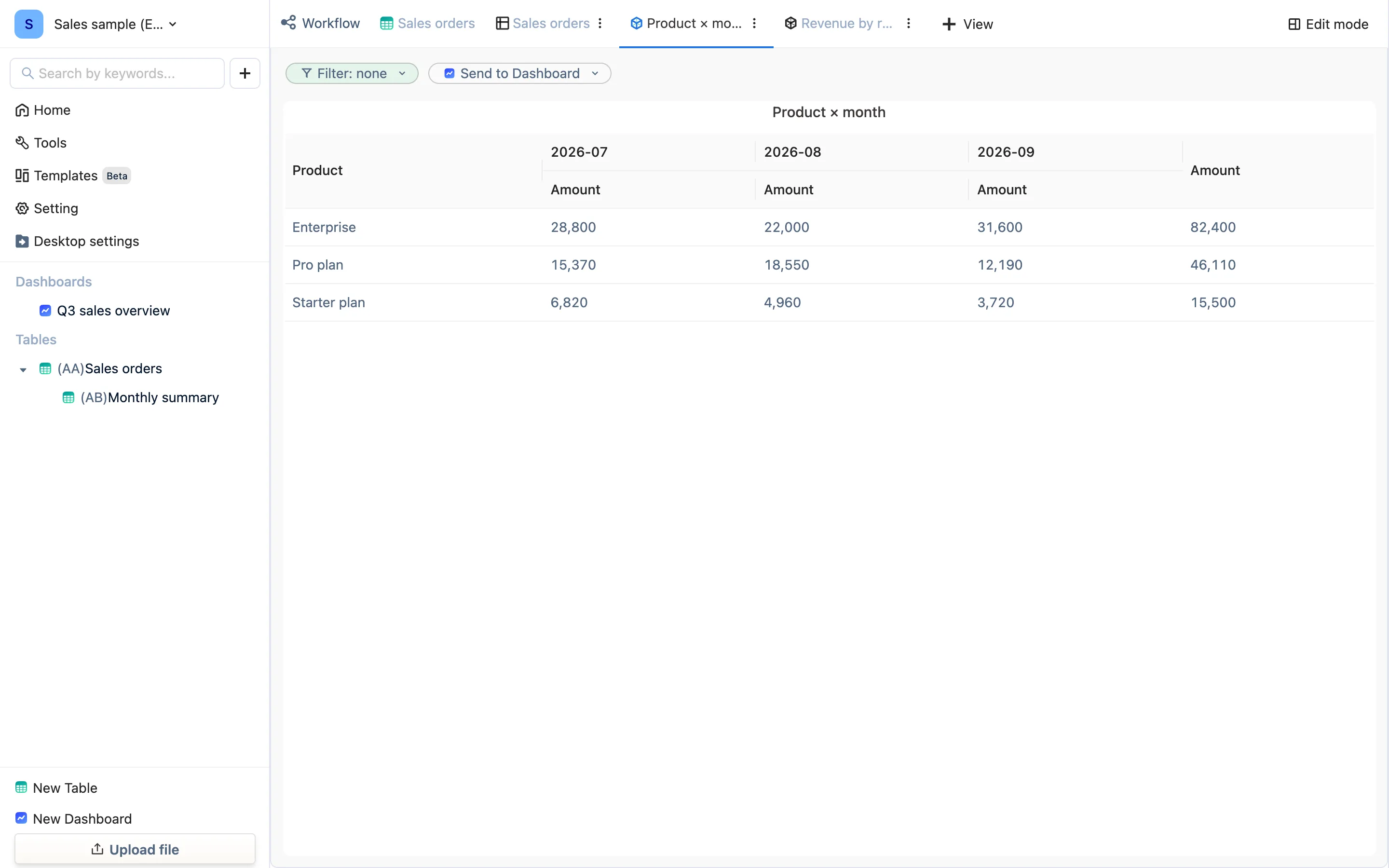
Four presentations
Under + View → Data Pivot:
| Type | Good for |
|---|---|
| Pivot Report | A cross-tab: one dimension down the rows, another across the columns, totals in the cells. Product × month, class × subject |
| Bar Chart | One dimension on X, the aggregate as height. Revenue by region |
| Line Chart | Trend, when the dimension is time. Orders per month |
| Pie Chart | Share of total. Revenue by region — the doughnut on the sample dashboard |
Configuration
In edit mode:
- Rows / columns (report) or Dimension (charts) — which column to group by. A report takes one dimension each way; a chart takes one.
- Values — which column, and what to do with it: sum, count, average, max, min and so on.
- Sort Order, Basic Filter, Data Limit — as in every other view.
- Display Aggregated Data — the report's totals row and column.
- Chart styling (data labels, legend, color rules) is the same as Bar & Line.
Pivot view or summary table?
| Pivot view | Summary table (Summarize panel, or hand-written SUMIF) | |
|---|---|---|
| Time to build | Seconds, two clicks | Pick columns, write conditions |
| Two dimensions | Directly | Needs a composite key |
| Add a column to the result (average order value, year-on-year) | No | Yes |
| Referenced by another table, exported to Excel | No | Yes |
| Put on a dashboard | Yes | Yes, through its views |
Pivot to look; summary table when the number becomes a definition, gets calculated further, or has to be exported. They coexist happily: the summary table does the arithmetic, the pivot view displays.
Clean the data first
A pivot groups on the literal value: "East" and "East " (trailing space) are two groups, and so are "paid" and "Paid". Normalize the dimension with a formula column first, then pivot on the clean column — which is exactly why the sample pivots on Region (clean) and not on the raw Region.