Ten minutes in — walk through the sample
Bring no files. The bundled sample workspace has a messy exported table, four formula columns, a summary table and a dashboard. Click through it and you will see the one thing that matters most: change a detail row and the summary and charts follow.
Step 1: open the sample workspace
A freshly installed TableDI is an empty workspace. The card on the home page says No data in here yet — click Start with sample data.
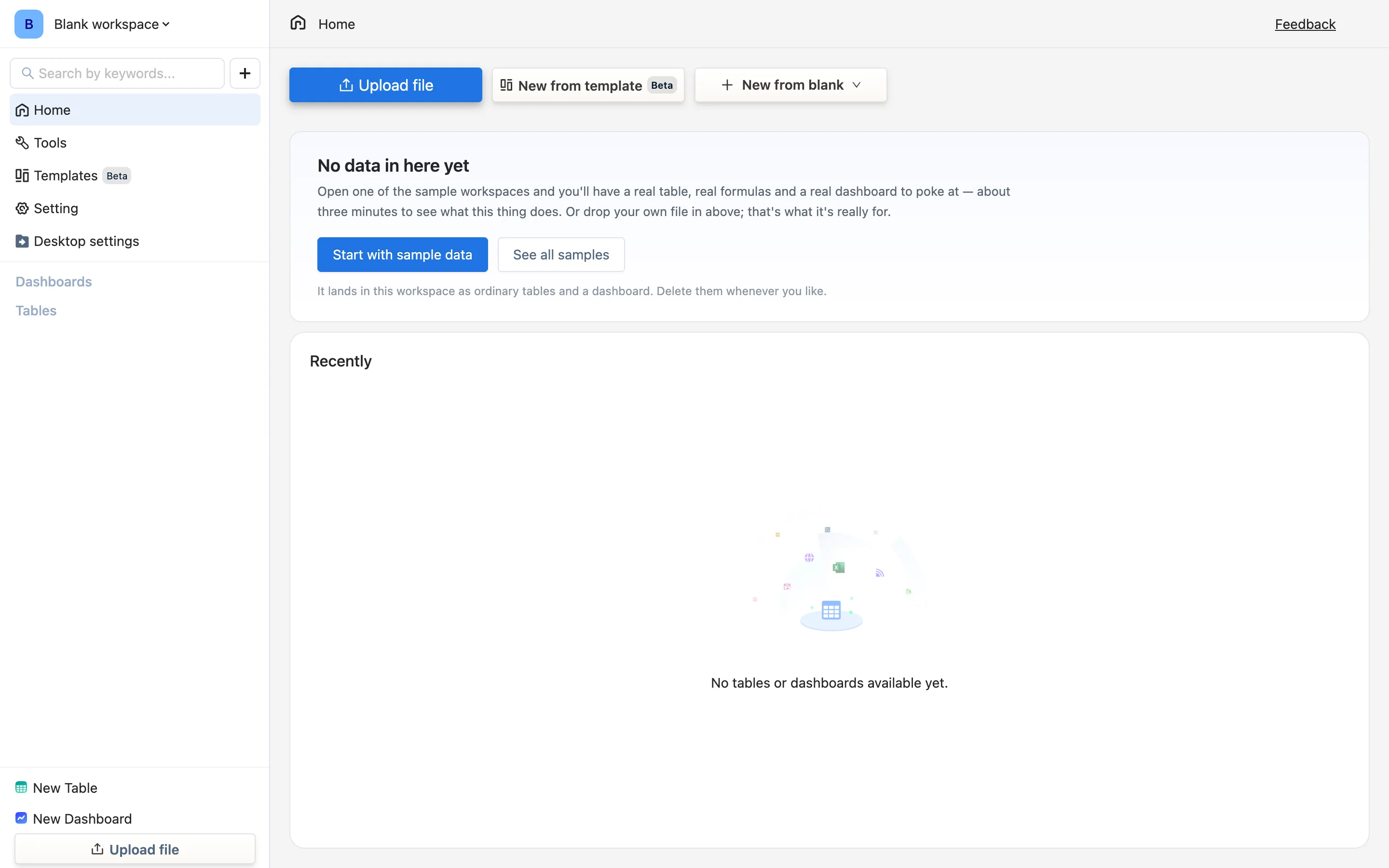
A few seconds later three things appear in the sidebar:
- Under Dashboards: Q3 sales overview
- Under Tables: (AA)Sales orders, with (AB)Monthly summary indented under it
That indent is not decoration — it means Monthly summary is calculated from Sales orders. The relationship comes back repeatedly.
That card only appears while the workspace is empty. To install a sample later, use Templates in the sidebar and its Sample data tab; there are three — sales, expenses, stock. Each is ordinary tables and dashboards, deletable at any time.
Step 2: look at the messy detail table
Click (AA)Sales orders in the sidebar. It is one quarter of sales orders, 38 rows, deliberately carrying the flaws a CRM export arrives with: the Region column has stray spacing and mixed capitalisation (North, north, NORTH), Status is written three different ways (paid, Paid, PAID), and two rows have no region at all.
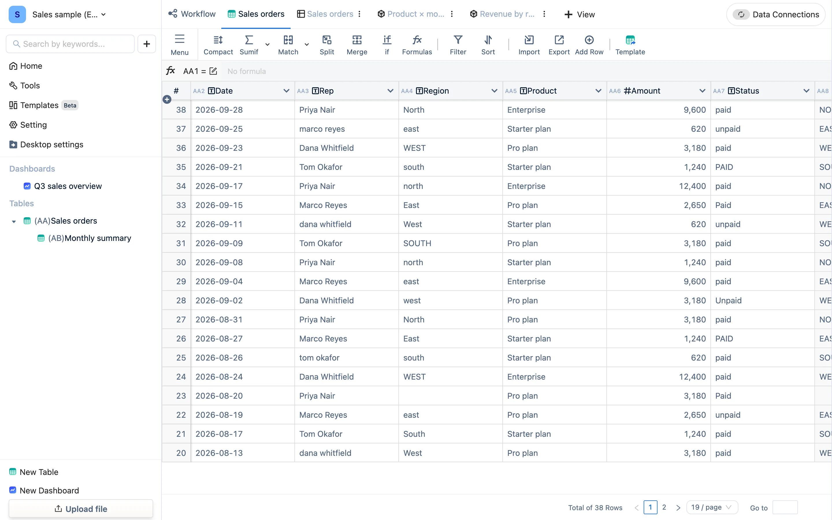
Look at the header row: every column carries a code — AA2, AA3 … AA11. AA is this table's code and the number is the column number. Every formula you write uses them — not "the Region column" but AA4.
The first six are raw data. The four after them carry an fx marker; they are formula columns:
| Column | Formula | What it does |
|---|---|---|
Region (clean) AA8 |
UPPER(TRIM(AA4)) |
Strips the spacing, normalizes the case |
Month AA9 |
LEFT(AA2, 7) |
Cuts 2026-09 out of 2026-09-28 |
Paid? AA10 |
IF(UPPER(TRIM(AA7)) = "PAID", "Paid", "Unpaid") |
Collapses three spellings into two values |
Collected AA11 |
IF(UPPER(TRIM(AA7)) = "PAID", AA6, 0) |
The amount if it was paid, otherwise 0 |
Click any formula column's header and the formula bar above shows that column's formula (column codes are displayed as column names there, which reads better).
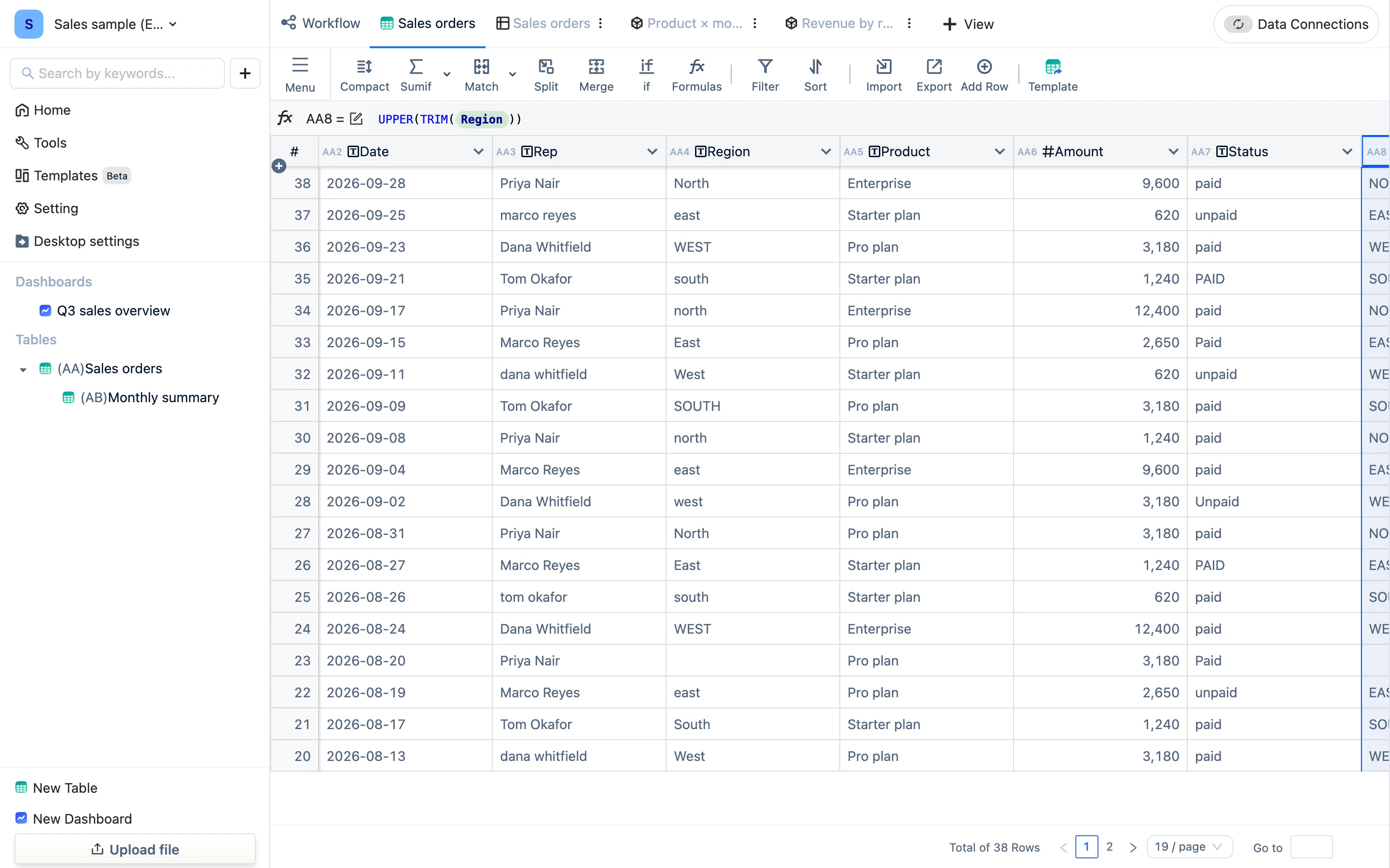
Not one character of the raw columns changed. The clean values grew in new columns beside them. That is the basic posture for cleaning data here: keep the original, derive a clean one.
Step 3: look at the Workflow graph
Click Workflow, the leftmost tab above the table.
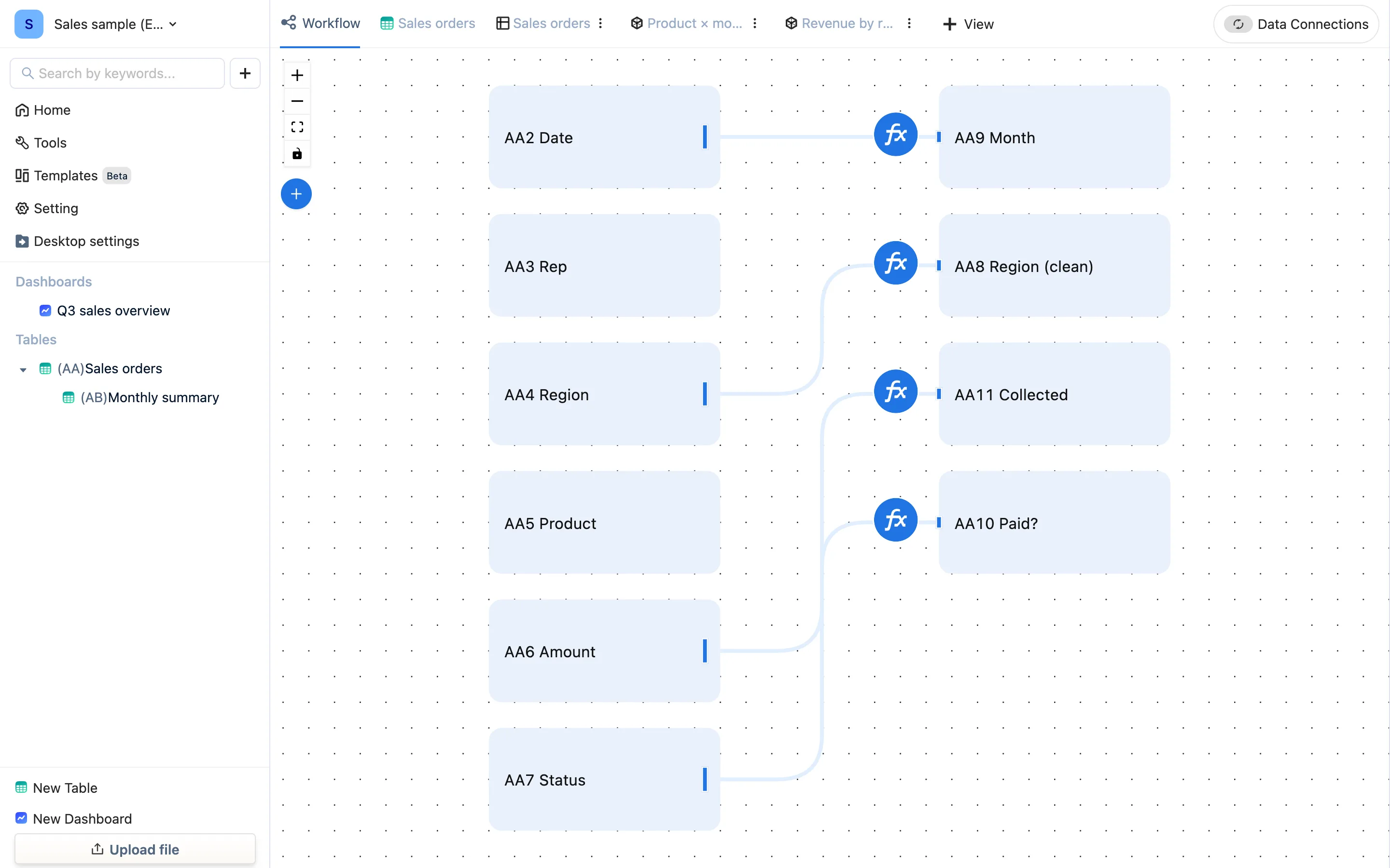
Every line is one reference: AA9 Month comes from AA2 Date; AA11 Collected uses both AA7 Status and AA6 Amount. Once you have several tables and a lot of formulas, this graph is the fastest answer to "where does this number come from".
Step 4: switch views
To the right of the Sales orders tab are two more: Product × month and Revenue by region. They are two views of this same table — not two more tables. There is one copy of the data.
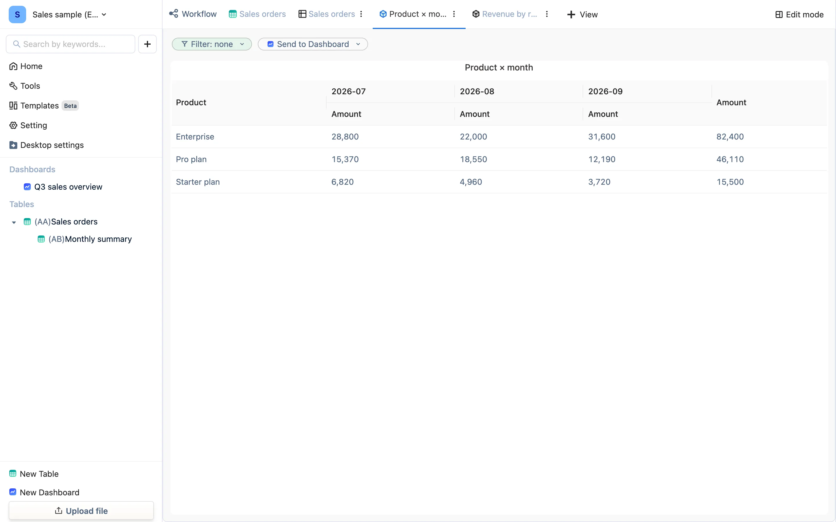
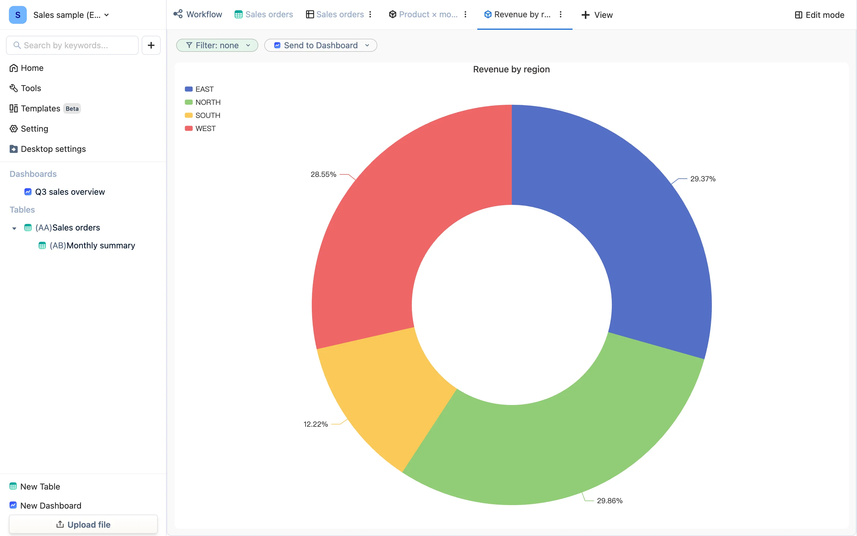
To add another way of looking at it, click + View at the right of the tab bar: worksheet, form, bar/line, pivot, stacked, funnel, gauge, metric and more all come from there. Each view keeps its own filter and sort, and none of it touches the table.
Step 5: look at a summary table that grew
Click (AB)Monthly summary in the sidebar. Five columns, three rows, and not one number was typed:
| Column | Formula | Meaning |
|---|---|---|
Month AB1 |
AA9 |
References the Month column of Sales orders, which yields one row per month |
Booked AB2 |
SUMIF(AA6, AB1 = AA9) |
Sum of amounts in Sales orders whose month equals this row's month |
Collected AB3 |
SUMIF(AA11, AB1 = AA9) |
Same, but summing the collected amount |
Orders AB4 |
COUNTIF(AA2, AB1 = AA9) |
How many orders this month |
Average order AB5 |
AB2 / AB4 |
Two columns of this same table, divided |
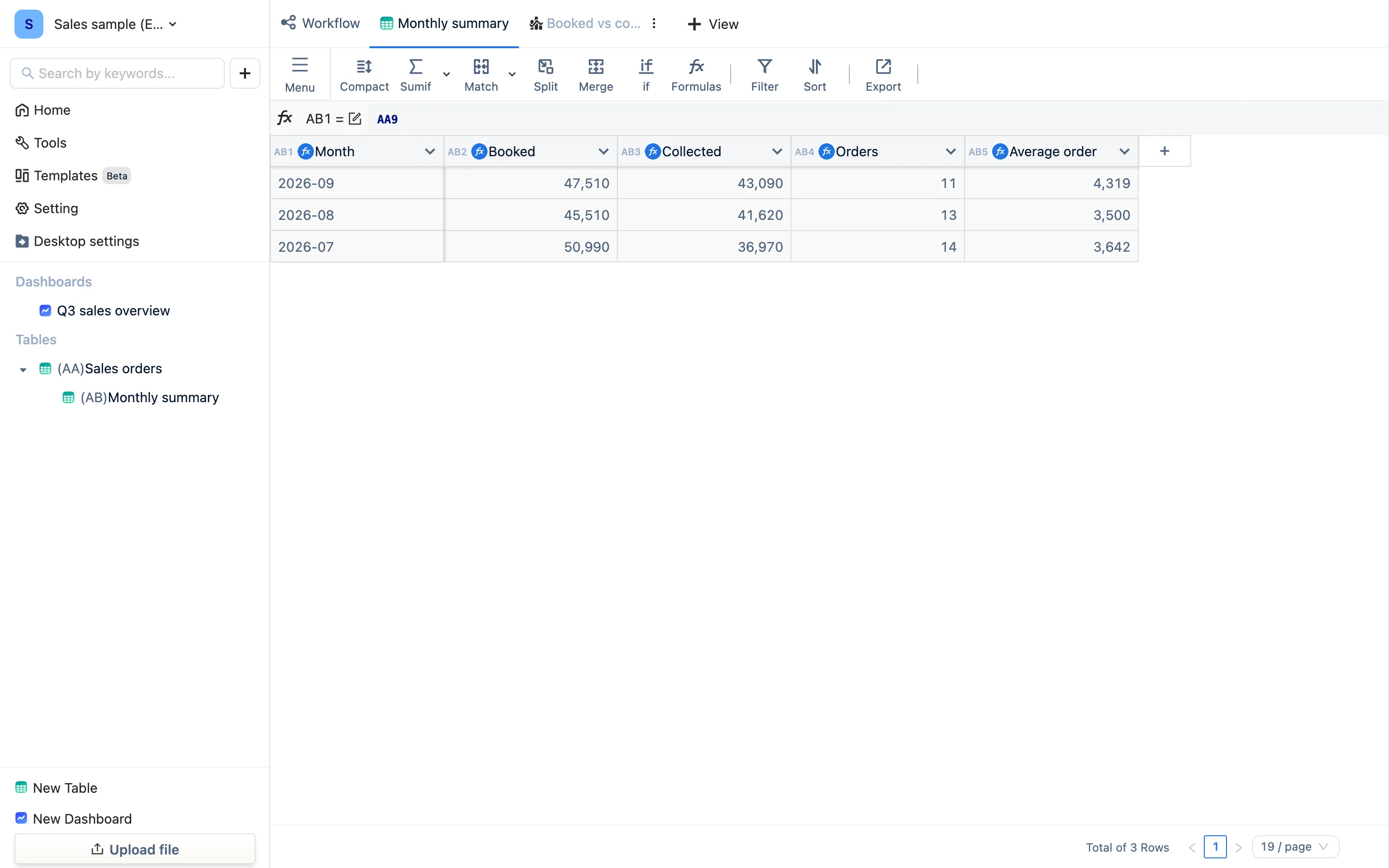
This is TableDI's version of a pivot table, with one difference: it is a real table. You can keep adding columns to it, other tables can reference it, and it can be charted. Paste next month's orders into Sales orders and a 2026-10 row appears here on its own.
Step 6: open the dashboard
Click Q3 sales overview in the sidebar.
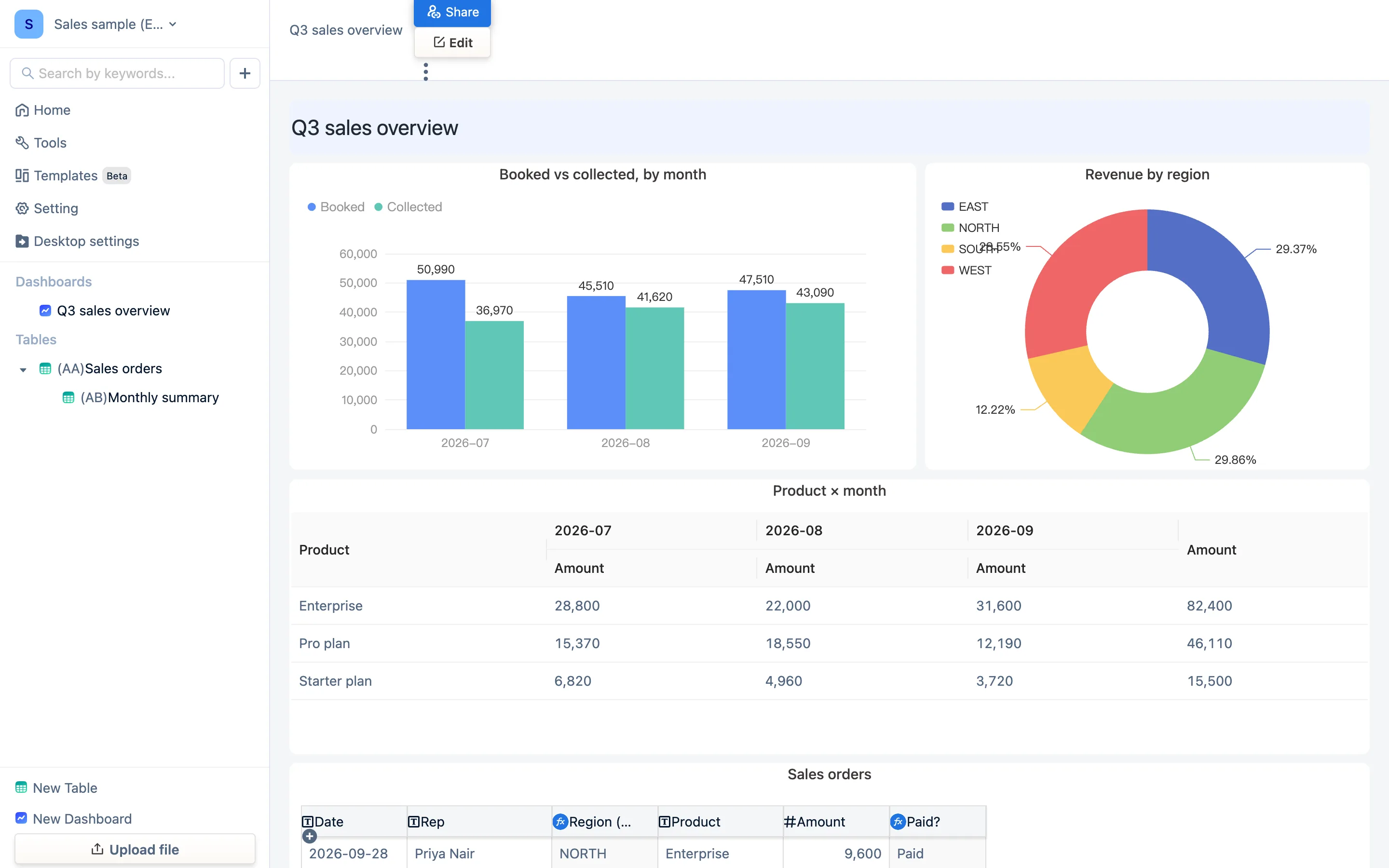
A dashboard stores no data of its own — it places views from several tables side by side and adds text and controls. Edit in the top right enters edit mode, where each block can be dragged and resized and new charts or text added from the right; changes save themselves.
Step 7: change one number and watch them all move
Go back to (AA)Sales orders, double-click any row's Amount and make it obviously different — turn 9,600 into 99,600. Then look:
- Booked and Average order for that month changed in Monthly summary;
- the bar chart and pie changed on the dashboard;
- the Product × month pivot changed.
You did not drag a formula, refresh a pivot table or rebuild a chart. That minute is the whole difference between this and Excel: there is one copy of the data, and everything after it is calculated from that copy.
Wrapping up
- The sample deletes like anything else: hover a row under Recently on the home page, click the ⋮ in the Actions column, choose Delete — or right-click it in the sidebar. Deleting the sample dashboard gives the free plan's one dashboard slot back.
- The next page shows you how to bring in your own Excel. Bring your messiest file; that is what this is for.