Bar & Line
One column on the X axis, one or more on Y, each drawn as a bar or a line — with left and right Y axes, data labels, color rules and null-as-zero. Best on summary tables and on data that is already one row per category.
One thing first
Bar & Line does not aggregate for you. Put month on X and amount on Y, and if one month has 20 rows you get 20 bars. So it suits two kinds of data:
- Tables that are already one row per category — such as a monthly summary grown out of a detail table;
- Series that are naturally one point per row (a reading a day).
To chart "amount by month" straight off a detail table, use the bar chart under Data Pivot — that one aggregates.
Configuration
+ View → Bar & Line, then Edit mode, data tab:
| Setting | What it does |
|---|---|
| Title | The name above the chart |
| X-Axis Value | One column — usually a month, a category or a date |
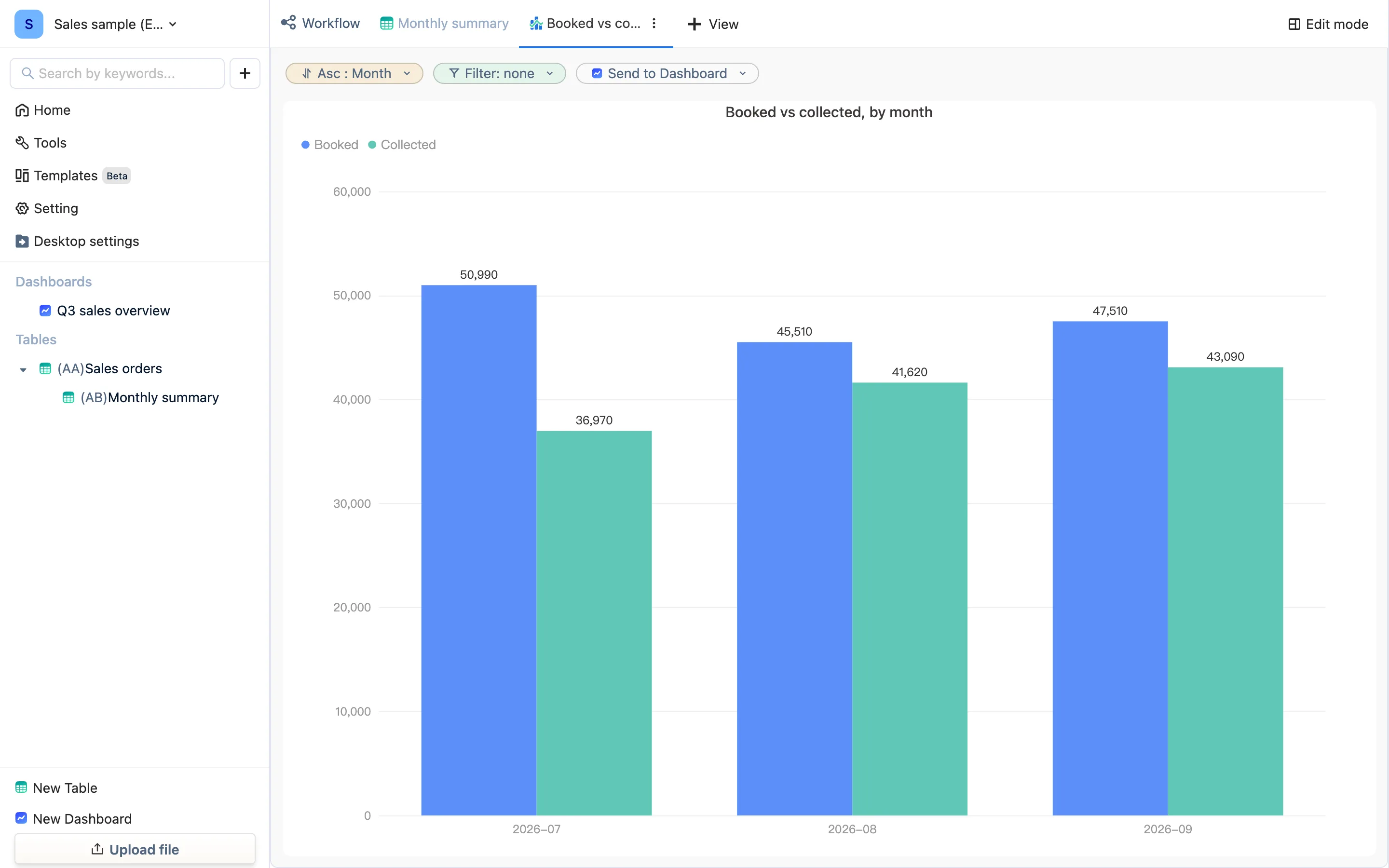
| Y-Axis Value | One or more columns (Add Y-Axis), each drawn as Bar Graph or Line Graph. Mix them and you get a combination chart — "Booked vs collected" on the sample dashboard is two bars |
| Sort Order | By X or by one of the Y columns, ascending or descending |
| Basic Filter | Chart only part of the data; same comparators as filtering |
| Data Limit | How many rows to take at most |
| Direction | from left to right or from right to left |
Style tab:
- Y-Axis Configuration — which columns hang off the Left Y-Axis and which off the Right Y-Axis, with a minimum and maximum for each. Split them when amounts and counts differ by orders of magnitude.
- Data Label — position (above, below, left, right, center) and rule: show all, hide all, only the maximum and minimum, only the latest, or at intervals.
- Add Color Rule — a condition (greater than / less than / equal to a value) mapped to a color. Bars over target turn red on their own.
- Replace Null with Zero — empty points draw as 0 so a line does not break.
- Legend, axis ticks, font size, Horizontal View (bars laid sideways) and Surface View (fill under a line).
Examples
- On the monthly summary: X = month, Y1 = booked (bar), Y2 = collected (bar).
- On a daily-reading table: X = date, Y = temperature (line), data labels showing only the latest, color rule > 80 in red.
- A store ranking: X = store, Y = revenue, sorted by Y descending, Horizontal View, data limit 10 — a top-ten bar chart.
On a dashboard
A finished chart can be referenced from a dashboard with Select exsiting views and the configuration is shared. You can also create the chart inside the dashboard; the settings are the same.