Creating a dashboard and adding charts
A dashboard is a canvas holding views from several tables plus some text and controls. How to create one, what each of the three buttons on the right adds, whether to reference an existing view or build a new chart, and the free edition's one-dashboard limit.
Creating one
- New Dashboard at the bottom of the sidebar, or Create Dashboard from the home screen.
- Give it a name and the editor opens. An empty one asks you to add a chart.
The free edition includes one dashboard; a second raises the upgrade prompt — A second dashboard is a paid feature. Free includes one dashboard. Upgrade for as many as you want. Deleting the old one lets you make another. Paid is unlimited.
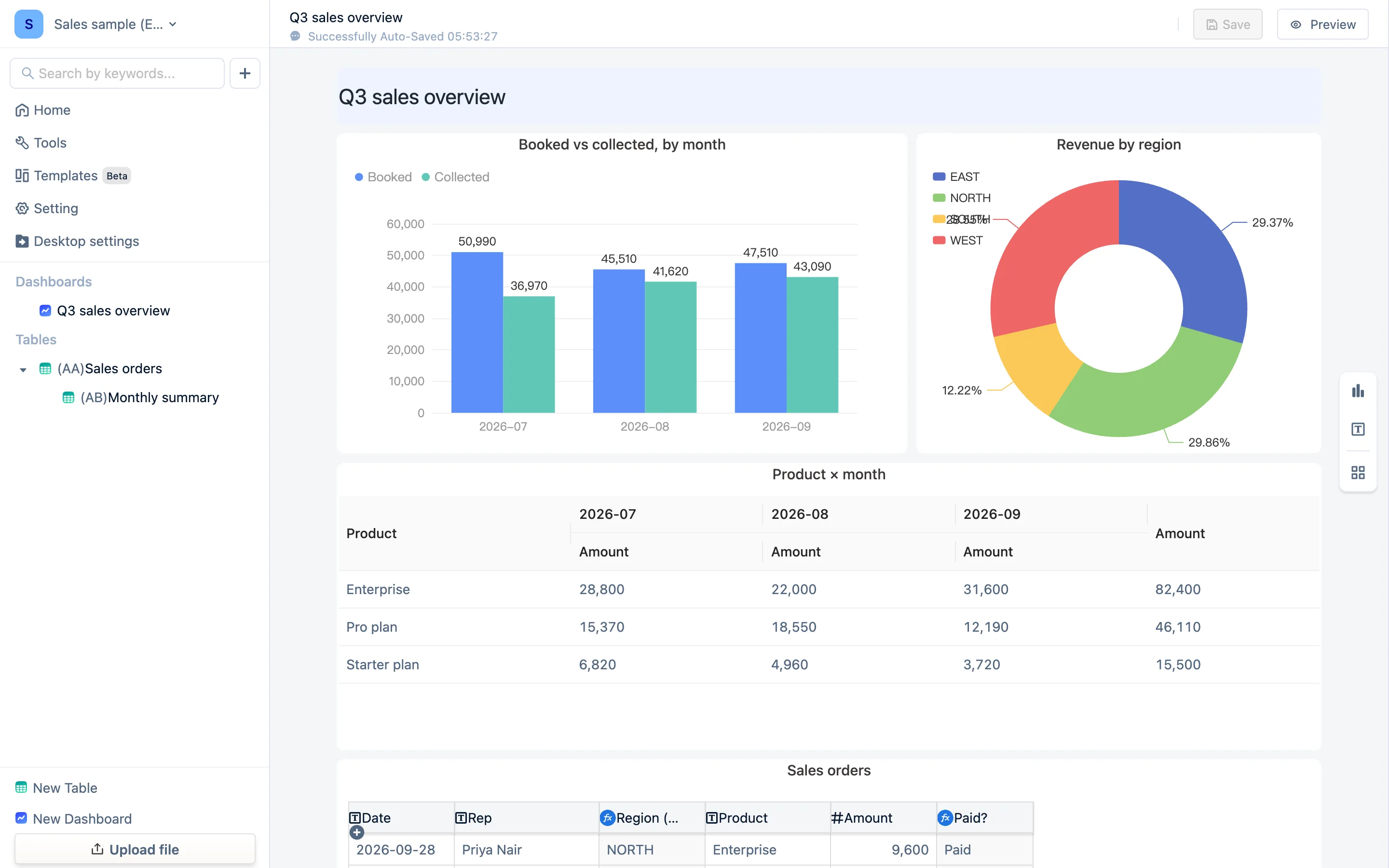
The three buttons on the right
| Button | What it adds |
|---|---|
| Create new views | Data components: worksheet, bar & line, data pivot, metric, signal map, time series, dropdown, radio, checkbox, gauge, funnel, stack. Pick a type, pick the table it sits on, and you get the same configuration panel as a view |
| Create basic views | Text Element, Embed, Text Input, Dropdown, Radio, Checkbox, Date Picker — the captions and controls that are not bound to a table |
| Select Table | Lists the tables in the workspace; Select exsiting views drops a view you already built straight onto the canvas |
Reference an existing view, or build a new one here?
- Reference (Select Table → Select exsiting views): shares one configuration with the view in the table, so a change in either place shows in both. Right when the chart in the table is already how you want it.
- Build here (Create new views → type → table): produces a chart configured for this dashboard alone. Right when the dashboard needs its own definition.
Both are live: the data changes, the chart changes.
What a dashboard usually looks like
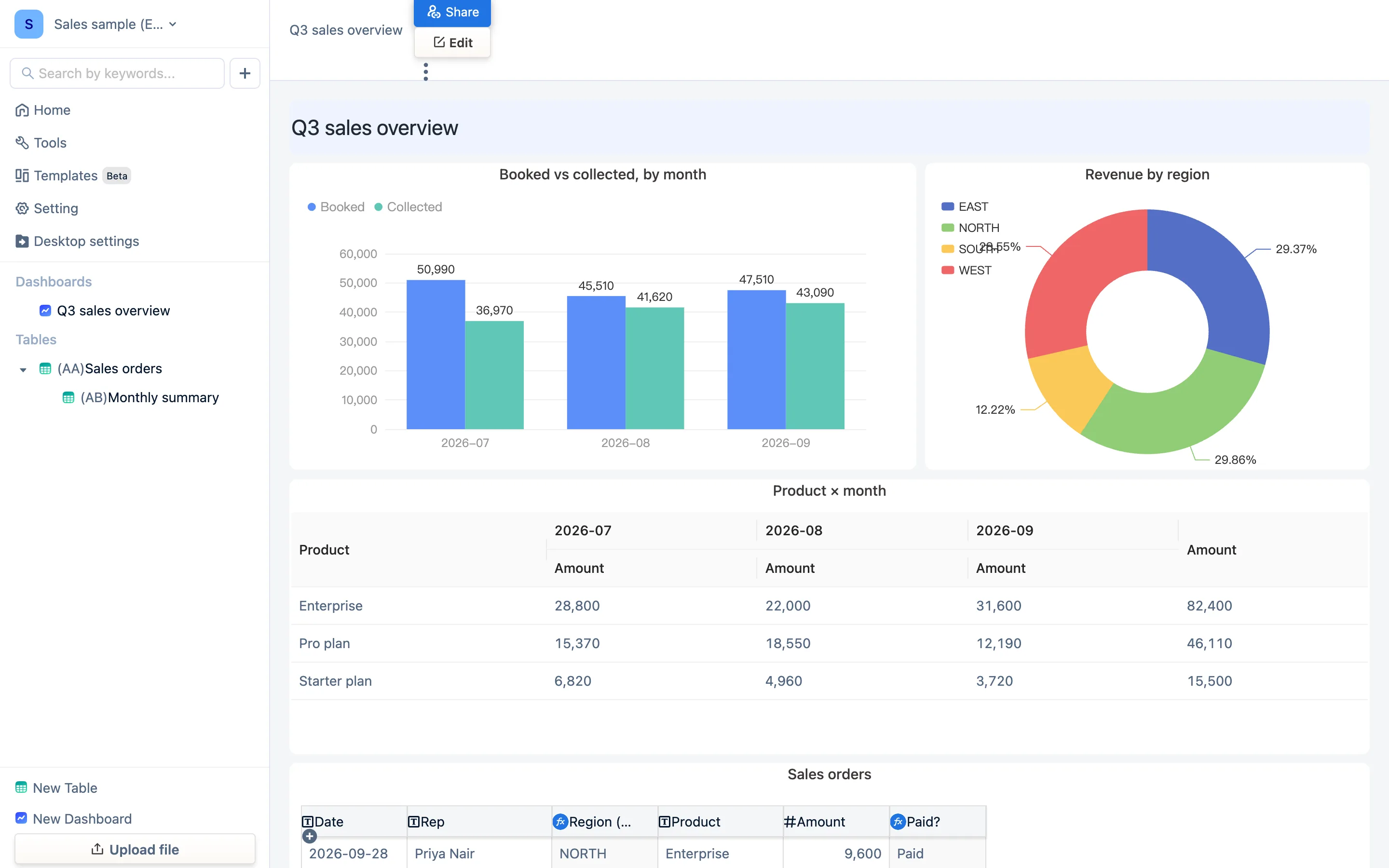
Taking the sample Q3 sales overview:
- A text element across the top as a heading.
- Top left, a bar chart on the monthly summary: booked vs collected.
- Top right, a pivot pie on the orders: share by region.
- In the middle, a pivot report: product × month.
- At the bottom, a worksheet: the order detail, paged.
One detail table and one summary table hold up five components.
Saving
The editor shows Successfully Auto-Saved with a time; you can also save by hand. Preview switches to view mode to see the result.
Next: Layout and inline editing.